
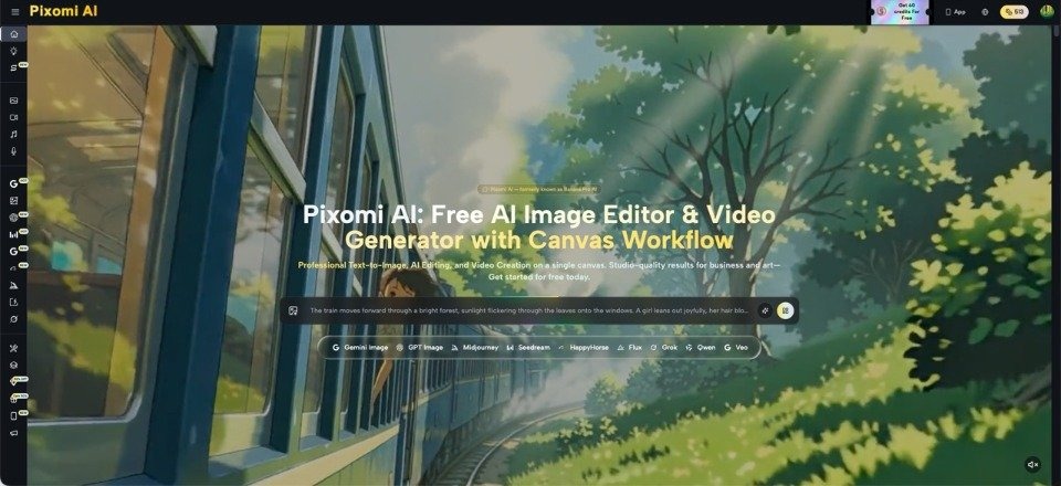
A faded poster showing a seaside promenade can make you nostalgic for a place you have never visited. Its limited colors, dramatic shadows, and oversized lettering suggest an entire era in one glance. That is why vintage travel posters still appear on apartment walls, café menus, and cultural-event invitations. But the style invites an interesting question: how do you borrow its visual language without pretending that a newly made image is a historical artifact? Modern creation platforms, including Banana Pro AI, which now operates as Pixomi AI, offer text-based image generation and editing that can help people explore a poster concept. The more interesting work remains human: choosing which features of a city deserve attention, deciding what to simplify, and making clear that the result is a contemporary interpretation rather than evidence of the past.
Why Old Travel Posters Still Feel So Immediate
Many classic tourism posters use a simple trick: they reduce a complicated place to a memorable silhouette. A curved coastline, a mountain ridge, or the arches of a railway station becomes the main character. The viewer does not need to recognize every building. The image communicates the mood of a destination before it communicates its geography.
Designers often work with a narrow palette and exaggerated contrasts. Warm orange against deep green might suggest late afternoon, while flat blue shapes create a sense of open air. Large areas of empty space make the image legible from across a room. These decisions give posters their strength; photographic detail is rarely the point.
Try looking at an old poster as a series of design choices rather than as a picture to copy. Identify its focal point, the relationship between foreground and distance, and where the lettering sits. Those elements can inform a new design without borrowing its original artwork.
Pick a Place You Actually Know
A meaningful city poster starts with observation. Instead of requesting “a beautiful European street,” choose a specific feature: a crowded book market, a bridge seen from a public staircase, or a row of painted doors on a quiet morning. Details that locals recognize make the image feel less like a generic travel advertisement.
Spend time with your own photographs or sketches. Notice what changes at different hours. A market may be most recognizable from its striped awnings, while a waterfront might be defined by the shape of the streetlamps rather than the boats. Decide whether you want to capture a location precisely or make a looser tribute to it.
Be careful with historical claims. If the poster references a city in the 1930s, check that the objects and landmarks belong to the period. Otherwise, describe the work as “1930s-inspired” instead of “a 1930s poster.” A modern tram in a retro painting can be a playful artistic choice; it becomes misleading only when presented as an authentic period image.
Where Inspiration Becomes Misrepresentation
Not every vintage-looking image belongs in the same category. A poster advertising a fictional rail journey is creative fiction. An image labeled as an original advertisement from a specific decade makes a factual claim. An exhibition graphic that imitates a surviving artist’s distinctive poster may also raise questions about copying rather than homage.
Use broad design principles instead of recreating a recognizable composition. Describe flat colors, simplified geometry, and bold lettering, rather than instructing a system to duplicate an identified artwork. Choose your own subject and make different decisions about layout and palette.
When sharing the result, explain the method briefly: “Contemporary illustration inspired by early travel posters.” That line preserves the enjoyment of the retro aesthetic while keeping the historical record separate from new creative work. If the design is for a museum or school project, add a date and a short explanation of which elements are imagined. Such small labels encourage curiosity without causing confusion.
Build a Poster Through Four Deliberate Choices
A poster does not improve automatically when its prompt gets longer. It improves when you make a few strong decisions and keep them consistent. This approach works whether you draw by hand, use design software, or generate an initial illustration.
- Find One Strong Landmark or Local Detail
Select one subject that carries the composition. A tram crossing a plaza is more specific than “busy historic city.” Place supporting details around it, not in competition with it. If your subject is a book market, perhaps two awnings and a stack of paperbacks tell the story better than a crowded street full of unrelated objects.
Write a single sentence explaining why the subject matters. That sentence will help you remove distracting visual elements later.
- Limit the Palette Before Adding Texture
Choose three or four dominant colors. For a coastal image, you might use sand, rust, navy, and cream. For an autumn market, try olive, brick red, charcoal, and pale yellow.
Keep the main shapes readable at a small size. Fine texture can add charm, but it should not hide the subject. If every surface is covered in simulated paper grain, the image may look old without looking thoughtfully designed.
- Generate or Edit the Illustration Separately
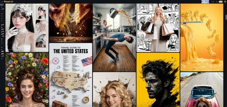
Describe the landmark, camera angle, broad color blocks, and simplified illustration style. Pixomi AI describes both text-to-image generation and reference-image editing, so you can begin with a written scene or adapt an image you have permission to use. Its Studio information also lists Nano Banana Pro as one available image model.
Review the output for invented street names, impossible architectural details, or visual features that misrepresent a real landmark.
- Add Typography With Intent
Put the city’s name where it supports the illustration. A large title across the sky may work well, while small text over textured stone rarely does. Set the final words carefully in a graphic editor, particularly when spelling, accents, and dates matter.
If the design celebrates a real cultural event, verify its name and year before publication.
Turn One Design Into a Small Cultural Story
A poster becomes more engaging when it gives viewers something to notice. Pair it with a short paragraph explaining why you chose its subject. Maybe the market has operated for generations, or the bridge is where residents gather at sunset. If a detail is historical, verify it independently before including it.
You could create a small series about ordinary places that tourists often miss: neighborhood bakeries, public stairways, or small squares. Keep the same palette rules across the set, but let each location have a distinct focal point. This makes the collection coherent without turning every city into the same postcard.
A school exhibition or local cultural blog could display the posters beside original photographs, clearly labeled as different kinds of images. That comparison invites discussion about memory, design, and the choices artists make when representing a place.
Conclusion
The appeal of a vintage travel poster lies in its confidence. It chooses one scene, simplifies it, and gives that scene a lasting mood. New creative tools can help people experiment with the style, but they do not replace local knowledge or historical care. Start with a place you can describe, select a distinctive feature, limit the color palette, and check every factual detail before presenting the result. Most importantly, keep a contemporary tribute separate from a genuine archival object. The goal is not to manufacture nostalgia for a history that never happened. It is to notice what makes a real place memorable and express that feeling through a fresh design. Pick one overlooked corner of your city and sketch its poster story.